What Color Are Incident/Construction Signs?
Table of Contents
Introduction
In the construction industry and during incident management, the color of signs plays a crucial role in ensuring safety and providing clear information. These signs are designed to be highly visible and easily recognizable, adhering to specific color standards set by regulatory bodies. Understanding the color scheme of incident and construction signs is essential for both workers and the public to navigate safely around construction sites and areas where incidents have occurred.
Color Standards for Incident/Construction Signs
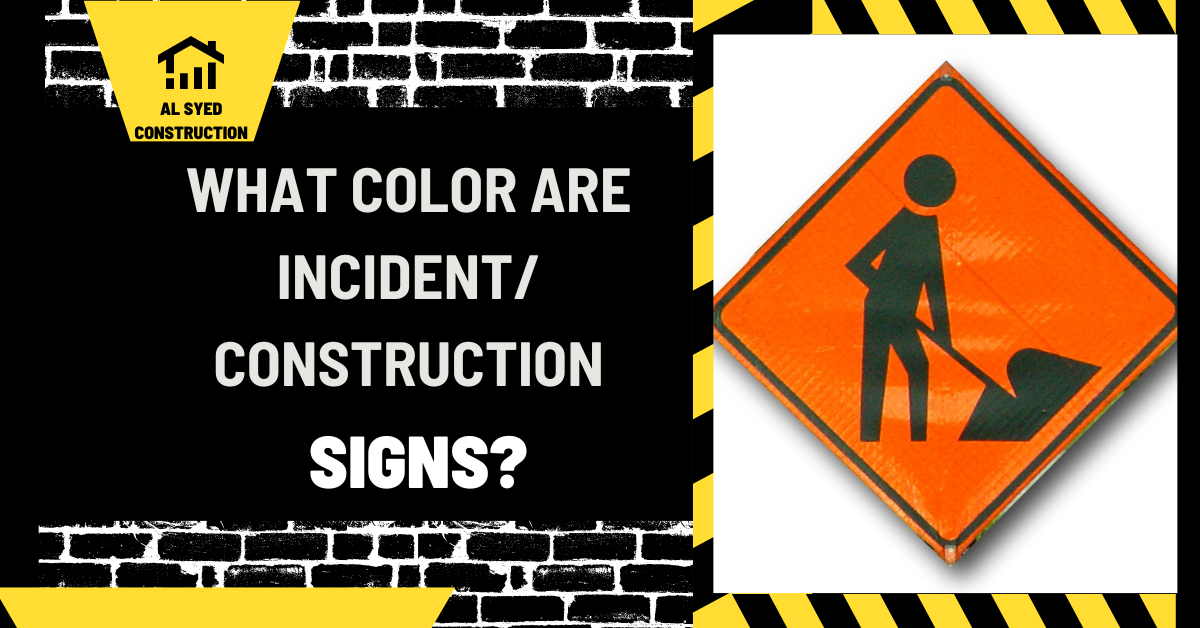
Orange for Construction
In construction zones, the most commonly used color for signs is safety orange. This bright, highly visible color is used for warning signs, detour signs, and other informational signs related to construction activities. The use of safety orange is intended to alert passersby and workers to potential hazards and changes in normal traffic patterns.
Fluorescent Pink for Incidents
For incident management, fluorescent pink is the designated color for temporary traffic control signs, such as those used at the scene of an accident or other unplanned incidents. This color was chosen for its high visibility and distinctiveness, making it easily noticeable in various environmental conditions.
Importance of Color in Safety Signs
Enhancing Visibility
The primary purpose of using bright colors like safety orange and fluorescent pink is to enhance the visibility of signs. This ensures that they are easily seen from a distance, even in low light conditions or inclement weather.
Conveying Urgency
The choice of color also conveys a sense of urgency and caution. Bright colors are associated with alertness and are used to draw immediate attention to potential dangers or important information.
Compliance with Standards
Regulatory Guidelines
The use of specific colors for incident and construction signs is regulated by standards set by organizations such as the Occupational Safety and Health Administration (OSHA) and the Manual on Uniform Traffic Control Devices (MUTCD). Compliance with these standards is mandatory to ensure consistency and effectiveness in safety communication.
Consistency Across Locations
Adhering to standardized color schemes ensures consistency across different locations and jurisdictions. This helps prevent confusion and ensures that the meaning of signs is universally understood.
Conclusion
The color of incident and construction signs is a critical aspect of safety and communication in these environments. Safety orange and fluorescent pink are the standard colors used for construction and incident signs, respectively, due to their high visibility and ability to convey caution. Compliance with regulatory standards and consistency in the use of these colors are essential for effective safety management and the protection of both workers and the public.